Performance Dashboard
The Performance Dashboard component is a built-in interactive auditing tool that helps users get a clear picture of the usage and performance of the platform knowledge graphs.
The dashboard monitors the entire query activity in the platform and includes predefined charts to highlight slow queries, high workloads, general activity, and timeframe comparisons. Users can filter and use the Performance Dashboard to analyze the data consumption and gain a better understanding of how data is used and if there are any issues to address.
Performance Dashboard components
The Performance Dashboard can be accessed through the Visualize tab and contains the following components:
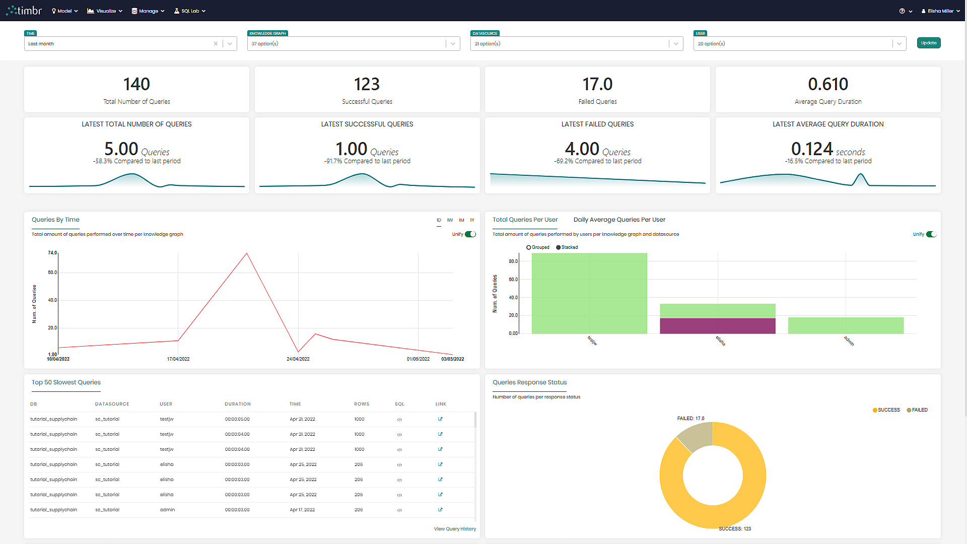
Dashboard Filters
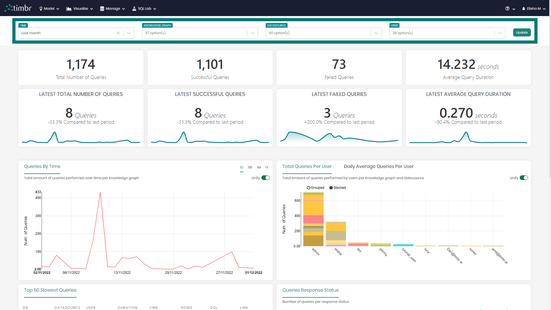
The dashboard filters above the different charts and metrics, enable users to drill down and get a deeper analysis of their knowledge graphs.
The current four filters include:
Time - Enables users to choose the time frame of the charts presented in the dashboard.
Knowledge Graph - Allows users to choose the specific knowledge graphs they want to analyze on the dashboard.
Datasources - Enables users to present data on the dashboard coming only from the selected datasources.
User - Presents data on the dashboard only for the chosen users.
Once changes are made in the filters, Update must be clicked in order for the filters to take effect, updating the dashboard metrics and charts.

Metrics
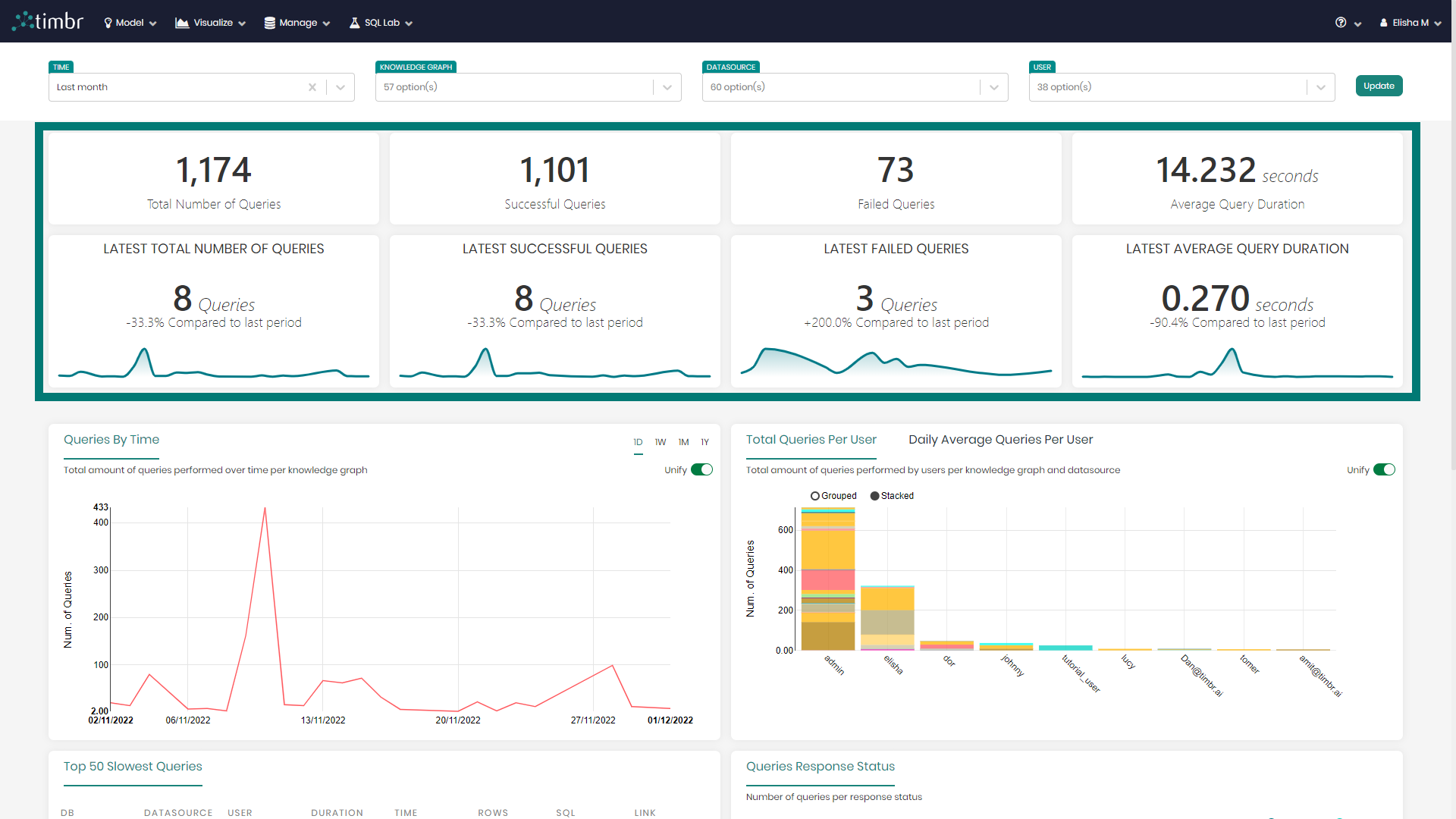
Below the filters are the eight metrics that include the following:
Total Number of Queries - Presents the total number of queries ran based on the chosen filters.
Successful Queries - States the number of successful queries ran out of the total.
Failed Queries - States the number of queries that failed while running.
Average Query Duration - Presents the average time it took to run the queries.
Latest Total Number of Queries - Shows the latest period (depending on the applied filters) total number of queries
Latest Successful Queries - Shows the latest period (depending on the applied filters) of successful queries
Latest Failed Queries - Shows the latest period (depending on the applied filters) of failed queries
Latest Average Query Duration - Shows the average query duration of the latest period (depending on the applied filters)
Below the eight metrics are the main charts.
Main Charts
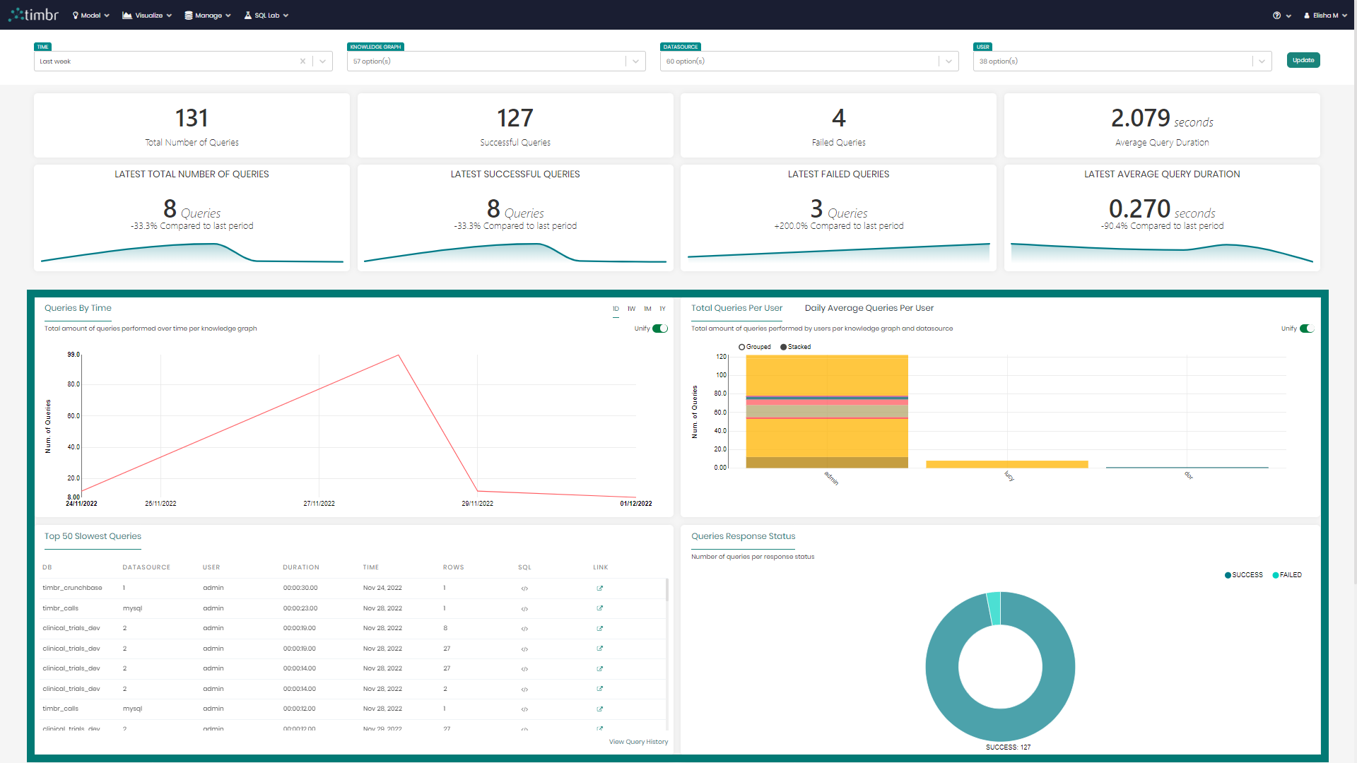
There are currently six main charts created using different visualizations, which include:
Queries By Time - A line chart presenting the number of queries over the selected time frame.
Total Queries Per User / Daily Average Queries Per User - A bar chart with the total and daily average number of queries per user.
Top 50 Slowest Queries - A table with various information regarding the top 50 slowest queries that were run.
Queries Response Status - A Donut chart presenting the query statuses by successful vs. failed.
Queries Average Duration - A bar chart presenting the query's average running time based on the selected time frame.
Query Duration Statistics - A candlestick chart showing the distribution of query duration and skewness per knowledge graph and datasource.
The different metrics and charts can be interacted with by simply hovering over and clicking on the desired metric or chart.